Feeling blue today? Getting energized by the beautiful orange sunrise? Or maybe you find yourself more focused when surrounded by calming greens. The psychology of color plays a powerful role in shaping our emotions, behaviors, and productivity. In fact, choosing colors for our surroundings, especially in a home office, can significantly influence how we think, feel, and work.
Have you ever noticed how some spaces instantly make you feel calm, while others spark energy and creativity? The psychology of color is no accident—each hue triggers a unique response in our brain. So, when it comes to designing your home office, choosing the right colors isn’t just about aesthetics. It’s about making an environment that boosts your focus, reduces stress, and keeps you inspired throughout the day. So what are the best office colors for productivity?
Understanding the Psychology of Color
Colors influence our emotions and behaviors in powerful ways. The right color hues can energize your mind, inspire creativity, or create a calm and focused environment. Below is a breakdown of popular colors, their effects, and how to use them in your home office:
Blue: The Color of Focus and Calm
Why It Works: Blue is associated with stability, reliability, and calmness. It stimulates the mind and promotes clear thinking, making it ideal for tasks requiring focus and concentration. Studies show that blue environments can reduce stress levels and foster a sense of trust.
Where to Use It:

- Walls or Backdrops: A light blue background can reduce mental fatigue and improve concentration.
- Accent Elements: Blue desk accessories or chair cushions add a calming touch.
Pro Tip: Combine blue with warm accent colors, like orange or yellow, to prevent the space from feeling too cold.
Green: The Color of Balance and Renewal
Why It Works: Green represents nature, balance, and growth. It’s easy on the eyes and reduces strain, making it perfect for prolonged work sessions. Green also fosters a sense of calm and restoration.

Where to Use It:
- Plants: Add natural green elements while improving air quality.
- Walls or Shelves: Use soft green tones to create a refreshing atmosphere.
Pro Tip: Place your desk near a window with greenery outside to naturally incorporate green hues into your space.
Yellow: The Color of Optimism and Creativity
Why It Works: Yellow stimulates emotions, creativity, and positivity. It’s an excellent choice for sparking innovative ideas and an uplifting mood.
Where to Use It:
 Accent Walls: A small section of yellow can brighten the room without being overwhelming.
- Decor: Use yellow in lamps, vases, or artwork for a cheerful touch.
Pro Tip: Use yellow sparingly, as too much can lead to overstimulation or anxiety and feeling overwhelmed. Yellow is best combined with softer tones.
Red: The Color of Energy and Action
Why It Works: Red grabs attention and increases heart rate, making it an energizing color. It’s particularly effective in settings requiring quick thinking or urgency. Red can also feel intense when overused.
Where to Use It:
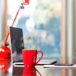 Small Accents: Incorporate red in picture frames, rugs, or organizers to either the desk or the surrounds for a pop of color.
- Inspirational Boards: Add red elements to keep energy levels high.
Pro Tip: Balance red with neutral tones like white or gray to prevent overstimulation.
White: The Color of Simplicity and Cleanliness
Why It Works: White reflects cleanliness, simplicity, and modernity. It can make spaces feel larger and more open but might lack personality if overused.
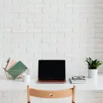
Where to Use It:
- Walls: Brighten your space with clean white walls.
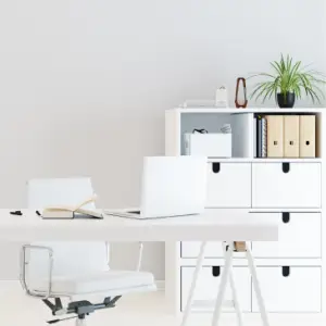
- Furniture: White desks and shelves create a sleek, professional look.
Pro Tip: Pair white with colorful decor to add warmth and character. An all-white area can look quite sterile.
Gray: The Neutral Ground
Why It Works: Gray is versatile and sophisticated, offering a neutral backdrop that allows other colors to shine. However, too much gray can feel dull or uninspiring.
Where to Use It:
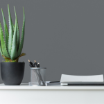 Accent Walls: Use warm gray tones for a cozy, modern feel.
- Furniture: Gray chairs or desks blend seamlessly with brighter accents.
Pro Tip: Combine gray with lively colors like green or yellow to keep the energy balanced.
Beige and Earth Tones
Why They Work: Beige and earthy hues are calming, neutral, and timeless. They create a cozy atmosphere, making them ideal for home offices.
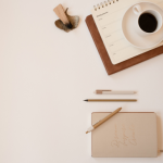 Where to Use Them:
- Walls: Beige tones provide a soft, inviting background.
- Rugs or Curtains: Add warmth with earthy textures.
Pro Tip: Pair beige with bold colors like navy blue or forest green for contrast, depth, and visual interest.
The Role of Color Intensity in Psychology of Color
The intensity of a color – it’s brightness or saturation – directly affects productivity. Bright colors energize, while muted tones calm and soothe. Don’t believe us? Observe your feelings and emotions when you come across a variety of colors in a shopping centre.
Examples:
- Bright Red or Yellow: Energizes but can be overwhelming in large amounts.
- Muted Green or Blue: Calms and soothes for better focus during long work sessions.
Pro Tip: Adjust the intensity of your chosen color to match your work needs. For example, use soft pastel blue for focus-heavy tasks and a brighter accent yellow for bursts of creativity.
Incorporating the Color Wheel
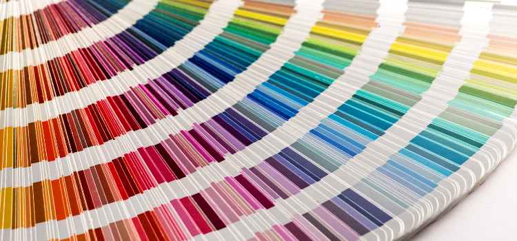
Using the color wheel and understanding the psychology of color can help create a home office that inspires focus, creativity, or calm, depending on your goals. Choose complementary or harmonious colors to enhance both the aesthetics and productivity of your workspace. We explain it a bit more below, and you can compare and contrast with the handy color wheel graphic.
Here are three popular approaches:
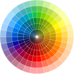
- Complementary Colors: Combine colors opposite each other on the wheel, like blue and orange, for high contrast and energy.
- Analogous Colors: Choose colors next to each other, such as green, blue-green, and blue for a cohesive and calming effect.
- Triadic Colors: Use three colors evenly spaced on the wheel, such as red, blue, and yellow, for a balanced and vibrant palette.
Practical Tips: Psychology of Color in Your Home Office
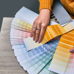
How to Choose the Colors you want?
- Test Before Committing: Paint small sections of your walls to observe how colors look in different lighting throughout the day. If possible, we have found observing this for a week or two is even more beneficial especially with weather changes.
- Mix and Match: Combine colors strategically to balance energy and focus. Have you seen a color combination you love somewhere else? Take a photo and try to copy the look.
- Use Accessories: Add pops of color with furniture, artwork, or rugs for flexibility. If you are looking for inspiration, we suggest you take a walk around some model homes or attend open houses to gather color ideas for your decor.
- Personalize: Choose colors that resonate with you to create a space that feels uniquely yours.
Finally, consider the colors …
Feeling inspired by a golden sunrise or a crystal-blue ocean? The colors you choose for your home office have the power to shape your mood, productivity, and creativity. And thus, do more than just brighten your walls. Whether you prefer the calming tones of muted blues and greens or the energy of warm yellows and reds, there’s an office color palette to suit every work style.
Choosing the right colors for your home office is more than a design decision; it’s a productivity strategy. By combining the psychology of color with smart design choices, you can create a home office that not only looks amazing but also supports your goals and well-being. So, take a moment to evaluate your workspace and let color be the key to unlocking your productivity potential.
References
- Cherry, Kendra. “Color Psychology: Does It Affect How You Feel?” Verywell Mind, updated January 2023, https://www.verywellmind.com/color-psychology-2795824.
- Ackerman, Courtney. “Color Psychology: The Complete Guide for Marketers.” Positive Psychology, September 7, 2021, https://positivepsychology.com/color-psychology/.
- Jill Morton. “Color and Productivity in the Workplace.” Color Matters, http://www.colormatters.com/color-and-design/color-and-productivity.
- Wright, Angela. The Beginner’s Guide to Colour Psychology. Routledge, 2017.
- Whitfield, Tom. “How Color Affects Mood and Productivity.” Interior Design Psychology Journal, vol. 23, no. 2, 2022, pp. 112-118.

